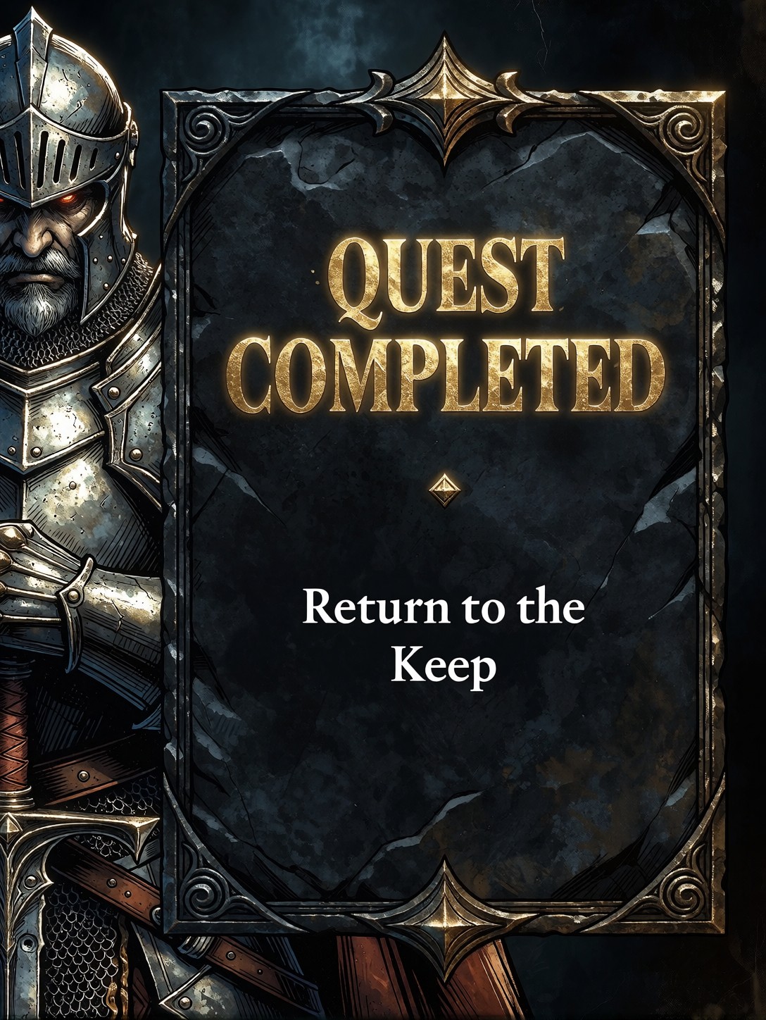
The Ink-and-Paint Collision Behind a Quest Completion Card
The most interesting thing about this prompt is the deliberate collision between two visual languages: high-contrast comic book ink lines and rich painted textures. That tension is what makes a graphic novel page feel alive — the clean linework gives structure while the painterly fills add depth and atmosphere. Here, the model has to hold both simultaneously across a structured UI layout: a stern armored knight anchored on the left, an ornate dark stone text frame dead centre, and two distinct text layers (glowing gold "QUEST COMPLETED" and crisp white "Return to the Keep"). The dark fantasy palette — deep stone tones, muted armour highlights, that single warm gold accent — keeps the whole composition from tipping into generic fantasy. The 8k tag pushes Proxima Aurelia 2 to resolve the ink line weight and the painted texture grain at high fidelity.
Indie Game UI, Comic Panels, and Fantasy Narrative Design
If you're building a dark fantasy RPG and need a quest completion screen that doesn't look like a default Unity template, this is the exact aesthetic to target. The graphic-novel framing gives it a hand-crafted feel that flat vector UIs can't replicate.
Other strong use-cases: storyboard panels for animated fantasy series, promotional key art for tabletop RPGs, and social media teasers for indie game launches where a single striking image does the heavy lifting.
Keep the aspect ratio at 16:9 (1344×768) — the horizontal layout mirrors how dialogue cards actually appear in-game, with the character on one side and the text block on the other. A portrait crop would force the knight and the frame to stack vertically and lose the natural reading flow.
Dialing In Proxima Aurelia 2 for UI Text and Mixed Media
Proxima Aurelia 2 is built for intelligent composition and rich visual storytelling from even simple prompts, which means the structured layout instructions here (knight left, frame centre, two text layers) will be respected without heavy prompt engineering. The mixed-media style — ink lines plus painted texture — is where you need to be careful with settings.
- CFG / Guidance:
3.0–3.5— enough to keep the ink lines sharp and the text legible without blowing out the gold glow into a flat white - Steps: 25–30 — the painted texture layer needs extra denoising passes to develop grain and depth; 12 steps will flatten it into a single tone
- Resolution:
1344×768(16:9) for the card layout; bump to1536×864if you're printing the output
The text rendering is the make-or-break element here. If "QUEST COMPLETED" comes back with garbled or missing letters, lower CFG to 2.5 and add the phrase "clearly legible, high-contrast text" to the end of your prompt — Aurelia 2 responds well to explicit legibility cues.
Five Ways to Reskin This Quest Card
5 Concrete Variations for the Quest Completion Layout
- Swap the character: Replace "stern armored knight" with "hooded elven mage, glowing staff, expression weary" — the same card layout now reads as a magic-quest completion, and the ink lines pick up flowing fabric movement instead of rigid plate armour
- Invert the palette: Change "dark stone" to "weathered bone and parchment, faded crimson ink" — the card becomes an ancient scroll rather than a stone tablet, the gold text shifts to deep red, and the whole mood goes from epic to archaic
- Go full comic: Add "halftone dot shading, speech bubble border, panel grid visible at edges" — the painterly texture backs off and the image becomes a pure comic book page, useful for webcomic-style game marketing
- Change the quest text: Swap "QUEST COMPLETED / Return to the Keep" for "DANGER DETECTED / The Gate Is Open" — same layout, completely different emotional register; the gold glow becomes a warning amber
- Add a second character: Append "and a young scribe on the right, quill in hand, looking up at the frame" — the composition becomes a two-person scene, the UI card reads as a shared moment rather than a solo status update
Two Prompts Ready to Generate
Both of these apply a variation from the list above and are tuned for Proxima Aurelia 2 at the settings recommended here.
Variation: ancient scroll palette — dark stone becomes bone and parchment, gold becomes crimson, the card reads as a recovered artefact
Game UI, Graphic Novel Aesthetic. A dark fantasy game dialogue card layout featuring a hooded elven mage with a glowing staff on the left. In the center, an ornate weathered bone and parchment text frame containing the bold, glowing crimson text "QUEST COMPLETED" at the top, and smaller crisp ivory text "Return to the Keep" below. High-contrast comic book ink lines mixed with rich painted textures, faded ink stains, sharp details, stylized UI layout, clean composition, 8k.
Variation: danger state — same knight, but the text shifts to a warning and the glow turns amber, the card becomes an alert rather than a reward
Game UI, Graphic Novel Aesthetic. A dark fantasy game dialogue card layout featuring a stern armored knight gripping his sword on the left. In the center, an ornate dark stone text frame containing the bold, glowing amber text "DANGER DETECTED" at the top, and smaller crisp white text "The Gate Is Open" below. High-contrast comic book ink lines mixed with rich painted textures, cracked stone details, sharp details, stylized UI layout, clean composition, 8k.
More Game UI and Fantasy Interface Prompts
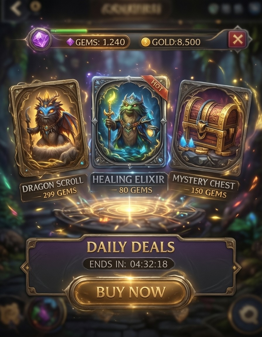
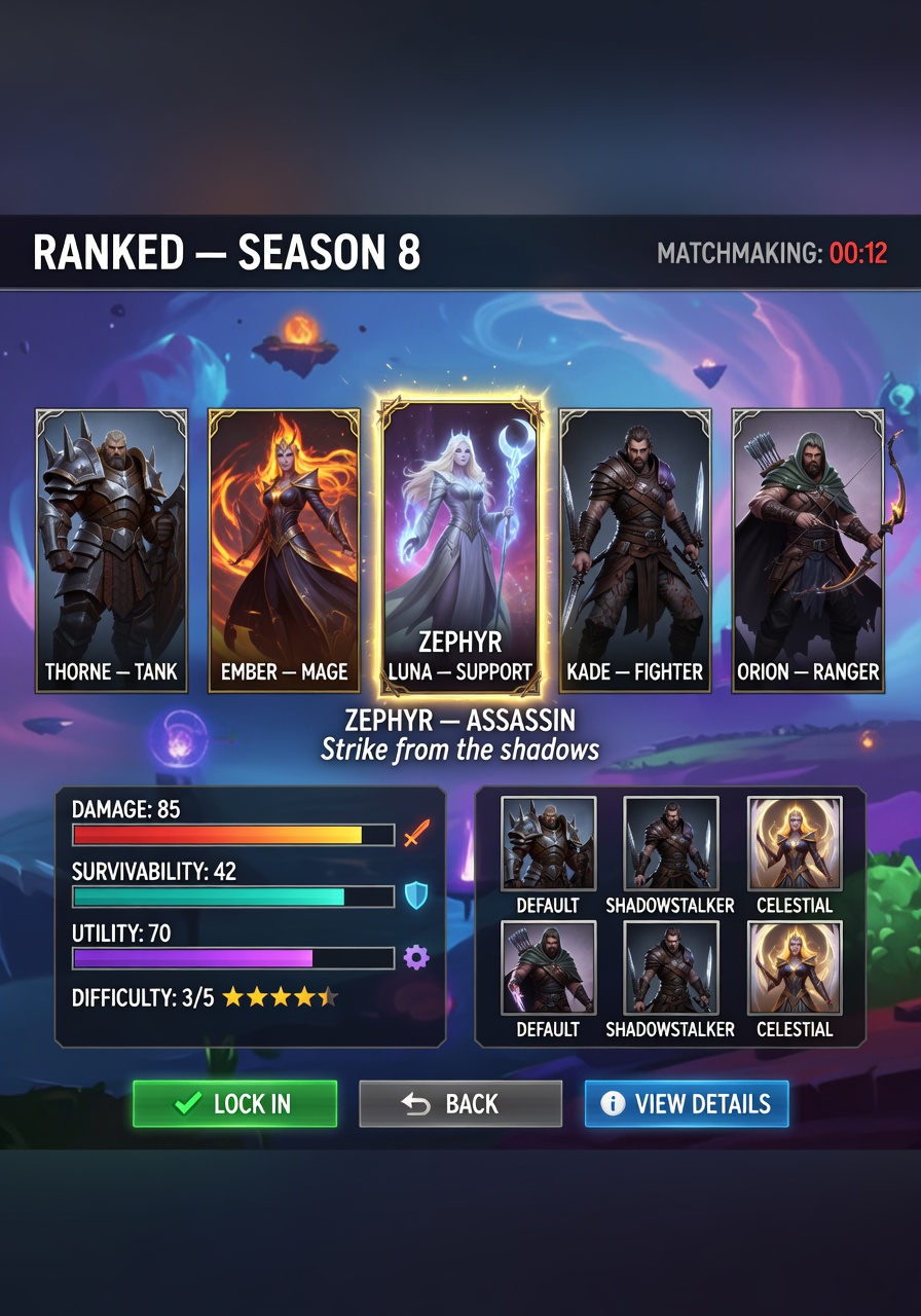
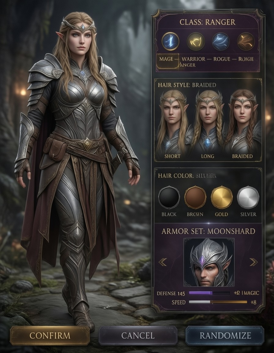
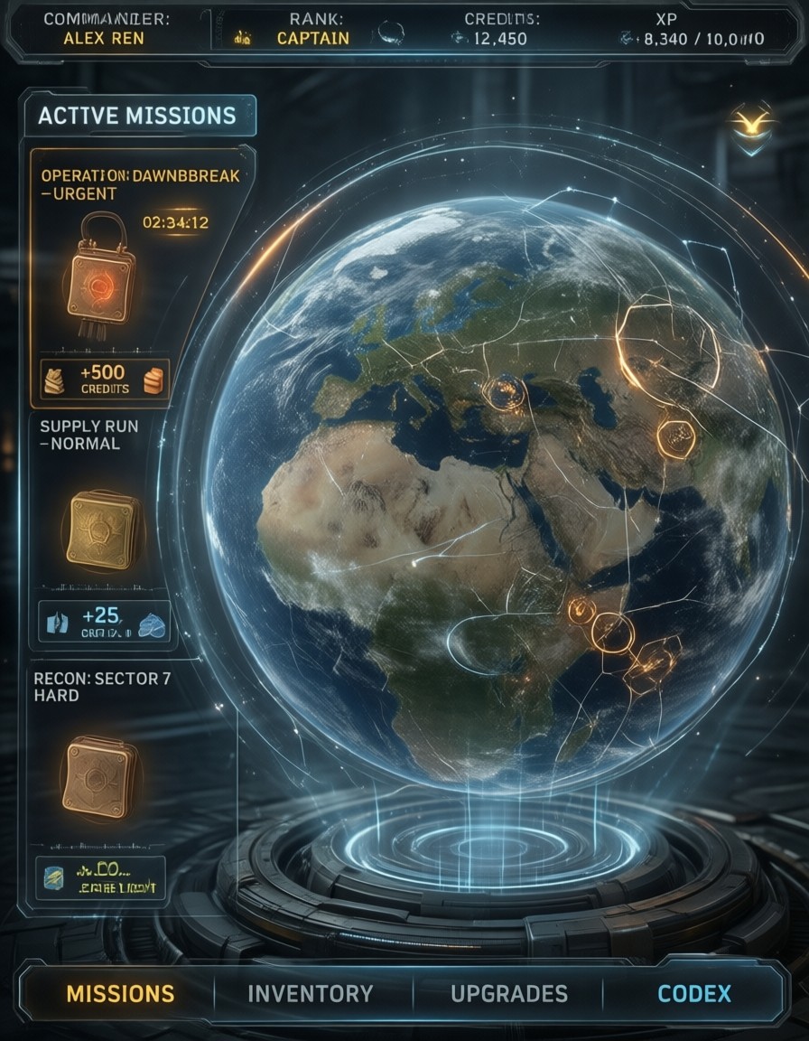
These related prompts explore the same territory from different angles — shop interfaces, hero selection screens, and strategy overlays — all built on the same graphic-novel and painted-texture foundation: