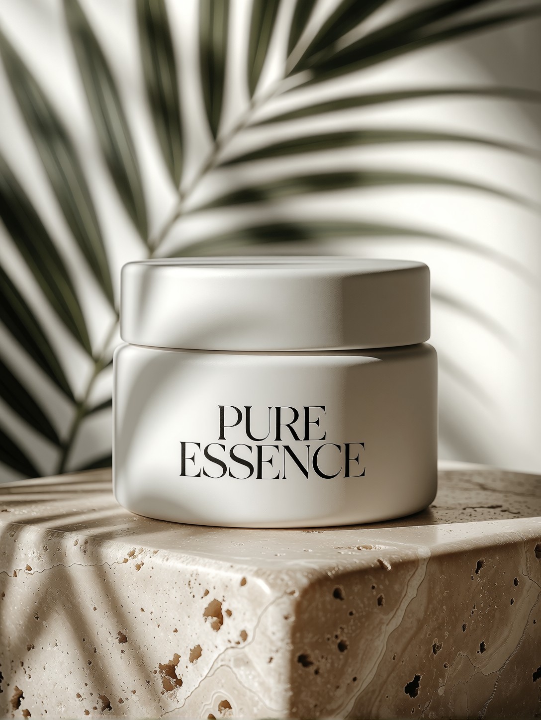
Quiet Luxury in Matte and Stone: How the Palm Shadows Do the Heavy Lifting
The most interesting element in this prompt isn't the jar or the marble — it's the soft palm shadows. That single phrase transforms a generic product shot into a scene with location, season, and mood. Proxima Aurelia 2 reads "palm shadows" not as a texture overlay but as a lighting event: dappled light falling from a specific angle, suggesting a warm climate and a particular time of day. The matte ceramic and travertine block then become surfaces that receive that light differently — the ceramic swallows it into a soft sheen, the stone catches it in its natural grain.
The instruction to print "PURE ESSENCE" in crisp black typography is a direct test of the model's text-rendering ability. Combined with the "balanced commercial layout" and "ample negative space at the top," you're asking Aurelia 2 to think like a brand designer, not just a photographer. That's exactly where its "intelligent composition" strength kicks in.
Brand Mockups, Ad Creatives, and Packaging Pitches
If you're building a visual identity for a skincare, wellness, or lifestyle brand, this prompt gives you a hero image that reads as a real studio shoot. It works directly as an e-commerce product banner, a social media ad creative (especially the 4:5 or 1:1 formats), or a slide in a packaging pitch deck where you need the product to look premium without a physical prototype.
For print or large-format use, generate at 1344×1792 (3:4 portrait) to preserve the negative space at the top for headline copy. Square crops (1024×1024) work well for Instagram and product cards but will compress the travertine texture.
Dialing In Proxima Aurelia 2 for Commercial Texture and Layout
Proxima Aurelia 2 is built on the Flux Schnell architecture, so standard Flux guidance values apply. Its particular strength — "exceptional aesthetics" and "intelligent composition" — means you can trust it with layout directives like "ample negative space" and "balanced commercial layout" without over-constraining the prompt.
- CFG / Guidance:
3.0–3.5— too high and the matte ceramic loses its subtlety, becoming plastic-like; too low and the "PURE ESSENCE" text may soften or garble - Steps: 25–30 for the full texture resolution on both ceramic and travertine; 12 steps is fine for a quick composition check
- Resolution:
1080×1440(3:4) for portrait product shots;1344×1792for print-ready output;1024×1024for square social formats
Aurelia 2 handles "soft diffused daylight" and "studio lighting" as a single coherent lighting setup rather than two competing instructions — you don't need to pick one or the other. Let both phrases stay in the prompt.
Five Ways to Push This Commercial Composition Further
5 Targeted Variations for This Packaging Prompt
- Swap the shadow source: Replace "soft palm shadows" with "long shadows from a single candle flame" — the mood shifts from tropical calm to intimate, almost ritualistic, and the warm light flatters the matte ceramic even more
- Change the stone: Replace "beige travertine marble" with "dark honed basalt" — the high contrast between white jar and black stone makes the product pop harder, ideal for a bolder brand identity
- Alter the typography: Change "crisp, elegant black typography" to "embossed gold foil lettering, no ink" — the text becomes a physical material rather than a print, pushing the luxury register up a notch
- Add a second object: Insert "a small sprig of dried eucalyptus resting against the jar" — one organic element breaks the geometric symmetry and adds a human, hand-placed feeling to the composition
- Shift the angle: Replace the implied top-down or 45° view with "extreme close-up, shallow depth of field, focus on the jar's rim and the shadow edge crossing the stone" — turns a product shot into an editorial texture study
Two Prompts Ready to Generate
Both examples apply variations from the list above and are tuned for Proxima Aurelia 2 at the settings recommended here.
Variation: dark basalt stone + embossed gold foil — high-contrast palette, text becomes a physical material
Luxury packaging ad creative. A minimalist matte-white ceramic skincare jar on a dark honed basalt stone block, soft palm shadows falling across the surface, embossed gold foil lettering reading "PURE ESSENCE" on the front of the jar, no ink, soft diffused daylight from the left, rich tactile texture of matte ceramic and polished stone, balanced commercial layout, ample negative space at top, studio lighting, ultra-detailed, 8k
Variation: editorial close-up with a single organic accent — shallow depth of field, eucalyptus sprig, texture-study framing
Extreme close-up product photography, shallow depth of field, focus on the rim of a matte-white ceramic skincare jar and the edge of a soft palm shadow crossing a beige travertine marble block, a small dried eucalyptus sprig resting against the jar, crisp black typography "PURE ESSENCE" partially visible, soft diffused daylight, rich tactile texture, commercial editorial style, ultra-detailed, 8k
More Packaging and Product Compositions in This Territory
These related prompts explore the same "quiet luxury" product-photography space from different angles — artisanal materials, bolder palettes, and category-specific packaging: