Molten Gold Meets Deep Teal: The Anatomy of a Fluid Expressionist Canvas
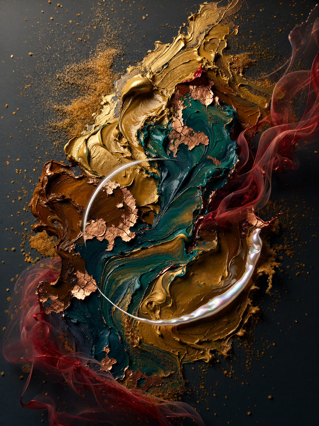
Very few abstract prompts give the model this much physical texture to work with — and that is exactly what makes this one sing. Molten gold and deep teal pigments collide mid-canvas like two weather systems meeting, while impasto (thick, sculpted paint texture) gives the surface real dimension. The crackled copper leaf accents and drifting crimson ribbons add layered chaos, but the true anchor is that single arc of iridescent pearl white cutting diagonally through everything — a clean line of order inside dissolution.
Qwen 2.1 handles this beautifully because of its fine-detail strength: the sand-like ochre granules scattered across the matte charcoal background resolve as actual grain, not blur, and the dramatic side lighting carves genuine shadows into the paint ridges. The result feels less like a generated image and more like a photograph of a heavy, physical canvas.
Print Shops, Album Covers, and Statement Walls
Large-format abstract art with real texture depth is the bread and butter of print-on-demand stores, and this palette — burnt umber, emerald, gold, slate blue — is sophisticated enough for interior design mockups and hotel art packages. Album and EP covers for jazz, ambient, or experimental music are another natural fit, since the tension between order and dissolution reads as emotional, not just decorative.
Go square (1024×1024) or 4:5 for gallery-style prints; the diagonal pearl arc benefits from a centered, balanced frame. Avoid ultrawide crops — they break the collision composition and scatter the granule detail into empty margins.
Settings for Qwen 2.1 — Preserving Texture Without Muddying the Palette
Qwen 2.1's native 2K output is a genuine advantage here: impasto ridges and copper leaf cracks need resolution to survive. Since there is no typography in this prompt, you can lean the model's full attention on texture fidelity.
- CFG / guidance:
3.5— enough adherence to keep the five-color palette disciplined; higher values tend to over-saturate the gold and crush the charcoal background - Steps: 30 for maximum quality — the layered materials (leaf, granules, translucent smoke) reward longer sampling; 12 steps works fine for composition previews
- Resolution:
1024×1024native square, or1080×1350for 4:5 print framing; upscale from 2K rather than regenerating at higher counts
Keep "matte charcoal background" in the prompt even when experimenting — without it, Qwen 2.1 tends to fill negative space with more pigment and loses the granule contrast that makes the ochre scatter visible.
Five Ways to Push the Fluid Expressionist Canvas Further
Five Targeted Variations for This Abstract Composition
- Invert the temperature: Swap "molten gold and deep teal" for "molten silver and burnt orange" — the collision becomes cold-hot instead of rich-cool, and the copper leaf reads as rust rather than luxury
- Slow the chaos: Replace "colliding mid-canvas" with "settling in slow laminar layers" — the composition turns from violence to geology, closer to agate or sediment strata
- Introduce a figure: Add "a single silhouetted hand emerging from the pigments" — the abstraction gains narrative tension and becomes a strong editorial or poetry-cover image
- Shift the light: Change "dramatic side lighting" to "backlit, raking low light like sunset through a window" — shadows stretch, the pearl arc gains a glow, and the mood turns cinematic
- Go vertical for banners: Add "tall vertical composition, 9:16, pigments cascading downward" — gravity takes over, the crimson ribbons become waterfalls of paint, ideal for phone wallpapers and story covers
Two Prompts Ready to Generate
Both examples below apply variations directly, tuned for Qwen 2.1 at cfg 3.5, 30 steps.
Variation: inverted temperature — silver and burnt orange replace gold and teal, turning the collision cold-hot and the copper accents to rust
Abstract Art, fluid expressionism. Molten silver and burnt orange pigments colliding mid-canvas, thick impasto textures with crackled rusted iron leaf accents, ribbons of translucent violet drifting like smoke. Fine ochre granules scattered across a matte charcoal background, a single arc of iridescent pearl white cutting diagonally. Dramatic side lighting emphasizing ridges and shadows, tension between order and dissolution. Palette of ash grey, copper, amber, slate blue. Highly detailed, 8k.
Variation: vertical cascade — 9:16 format where gravity pulls the pigments downward, turning crimson ribbons into falling streams of paint
Abstract Art, fluid expressionism, tall vertical composition, 9:16. Molten gold and deep teal pigments cascading downward like slow waterfalls, thick impasto ridges, crackled copper leaf accents, ribbons of translucent crimson streaming down like smoke. Ochre granules scattered across matte charcoal, one iridescent pearl white arc sweeping diagonally. Backlit raking sunset light stretching shadows across paint layers. Palette of burnt umber, emerald, gold, slate blue. Highly detailed, 8k.
More Texture-Driven Abstract Prompts to Explore
If the granular, fractal-adjacent detail in this composition is what hooked you, these prompts dig into similar territory — iridescent surfaces, glowing filigree, and macro material study: